I aimed to make the quote process clear and smooth for users by turning a complex form into an easy, step-by-step experience that builds trust and saves time.

Ajay Jotangiya
UI/UX & Graphics Designer
I aimed to make the quote process clear and smooth for users by turning a complex form into an easy, step-by-step experience that builds trust and saves time.
Ajay Jotangiya
UI/UX & Graphics Designer
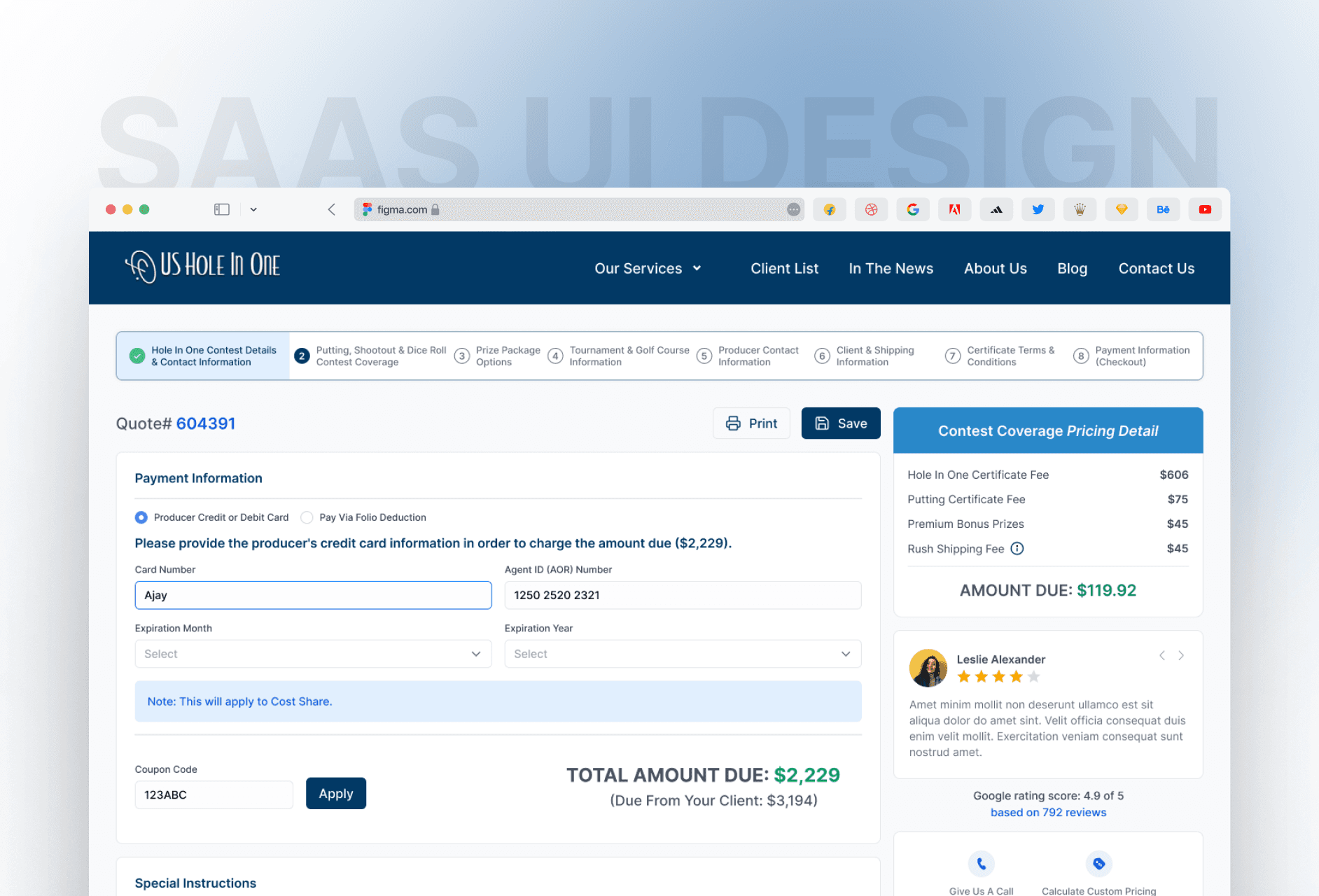
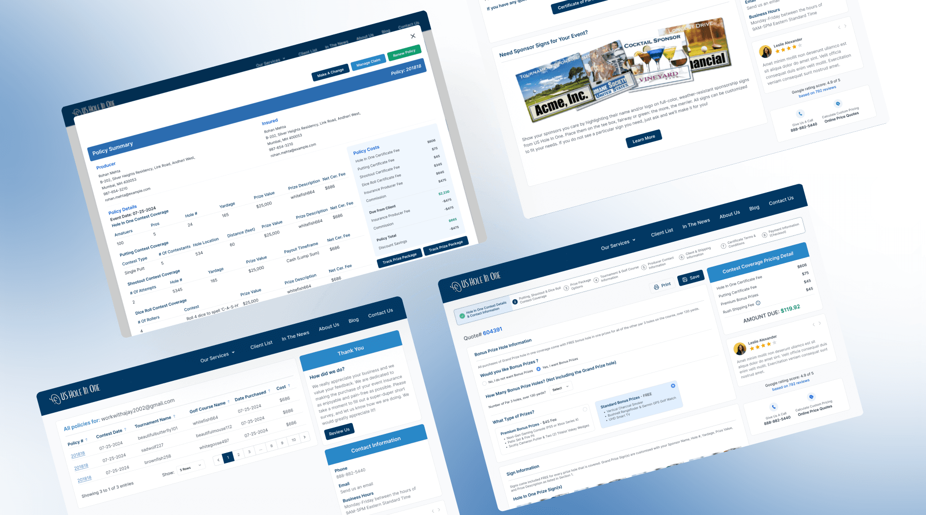
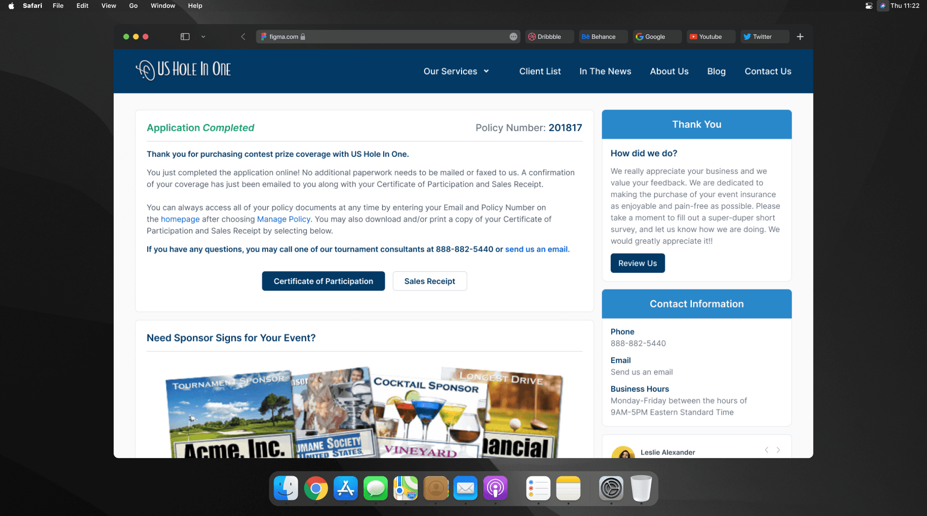
This project focused on improving the 9-step quote journey users follow when applying for golf event insurance. The goal was to reduce drop-offs and make the experience more organized and user-friendly.
This project focused on improving the 9-step quote journey users follow when applying for golf event insurance. The goal was to reduce drop-offs and make the experience more organized and user-friendly.
Understanding the Problem
The original quote flow was cluttered, long, and not mobile-friendly. Users often dropped off before completing the form. My goal was to rethink the entire experience and make each step simple and predictable, without overwhelming the user.
The layout lacked clear guidance, and multiple fields shown at once made it feel heavy and confusing especially on smaller screens. There was no progress feedback, which left users unsure how much was left to complete. Important form inputs were not grouped properly, leading to cognitive load. These usability issues created friction and affected conversion. It was clear the journey needed to be broken down into manageable, focused steps with better structure and visual clarity.
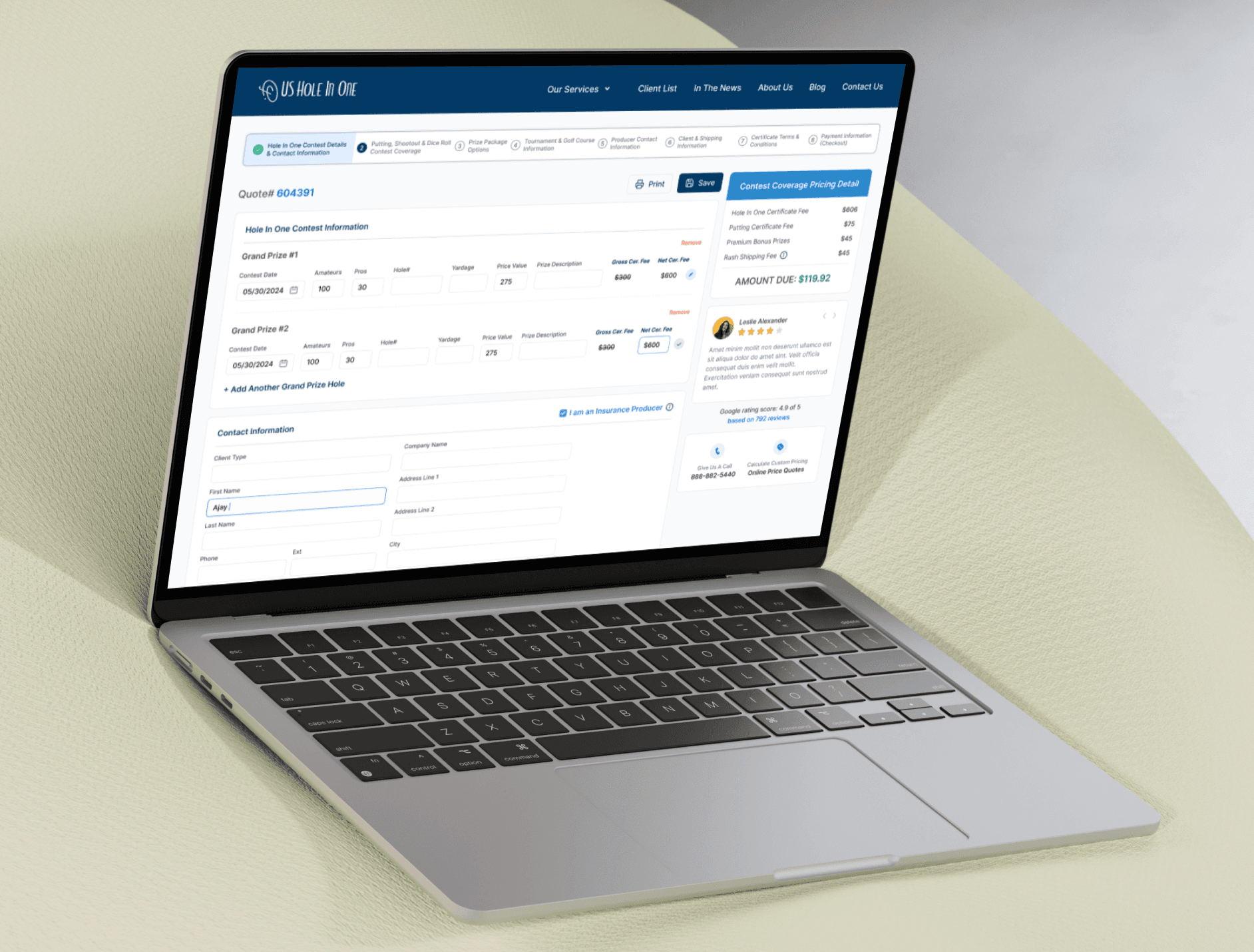


Design Approach and Final Output
I started by mapping the existing journey and understanding where users might get confused or stuck. Then, I broke the entire flow into 9 clean steps each focused on one input at a time. I used Figma to design the UI, keeping a clear visual hierarchy, clean typography, and proper spacing to ensure it’s easy on the eyes.
Every step includes progress indicators to help users see where they are in the process. I also simplified labels, added tooltips where needed, and used strong CTA buttons to guide users. After implementing these changes, the quote journey looked more modern, felt easier to follow, and had a better user flow overall.
Latest projects
Website
Landing Page Refinement for Ticket Marketplace Platform
Refined an AI-generated landing page to improve visual quality, structure, and user experience.

Website
Landing Page Refinement for Ticket Marketplace Platform
Refined an AI-generated landing page to improve visual quality, structure, and user experience.
Website
Tour Booking Website Design for Online Growth
Designed a 3-page tour booking website to help a travel business build online presence and simplify bookings.

Website
Tour Booking Website Design for Online Growth
Designed a 3-page tour booking website to help a travel business build online presence and simplify bookings.
Latest projects
Website
Landing Page Refinement for Ticket Marketplace Platform
Refined an AI-generated landing page to improve visual quality, structure, and user experience.
Website
Tour Booking Website Design for Online Growth
Designed a 3-page tour booking website to help a travel business build online presence and simplify bookings.

