
I focused on creating a clear and modern layout that explains the platform benefits for each user type and encourages them to join the network.

Ajay Jotangiya
UI/UX & Graphics Designer
I focused on creating a clear and modern layout that explains the platform benefits for each user type and encourages them to join the network.
Ajay Jotangiya
UI/UX & Graphics Designer
The previous landing page layout was outdated and did not clearly communicate the platform’s purpose. It was hard for users to understand who the platform is for and why they should join. I redesigned the page to introduce the platform clearly, highlight benefits for each user group, and guide users to sign up with a smoother structure.
The previous landing page layout was outdated and did not clearly communicate the platform’s purpose. It was hard for users to understand who the platform is for and why they should join. I redesigned the page to introduce the platform clearly, highlight benefits for each user group, and guide users to sign up with a smoother structure.

Understanding the Main Issues
The old design used a generic layout and the messaging was hard to follow. Users could not quickly see what the platform does, who it is built for, or how to join. The page did not support the variety of users in the construction ecosystem.
I analyzed how tradesmen, contractors, suppliers, and industry partners make decisions when choosing platforms. I then structured the landing page to speak directly to each user type. The introduction explains the core purpose, followed by a clear section showing what each group gains. This guides users to see themselves in the platform and reduces confusion.


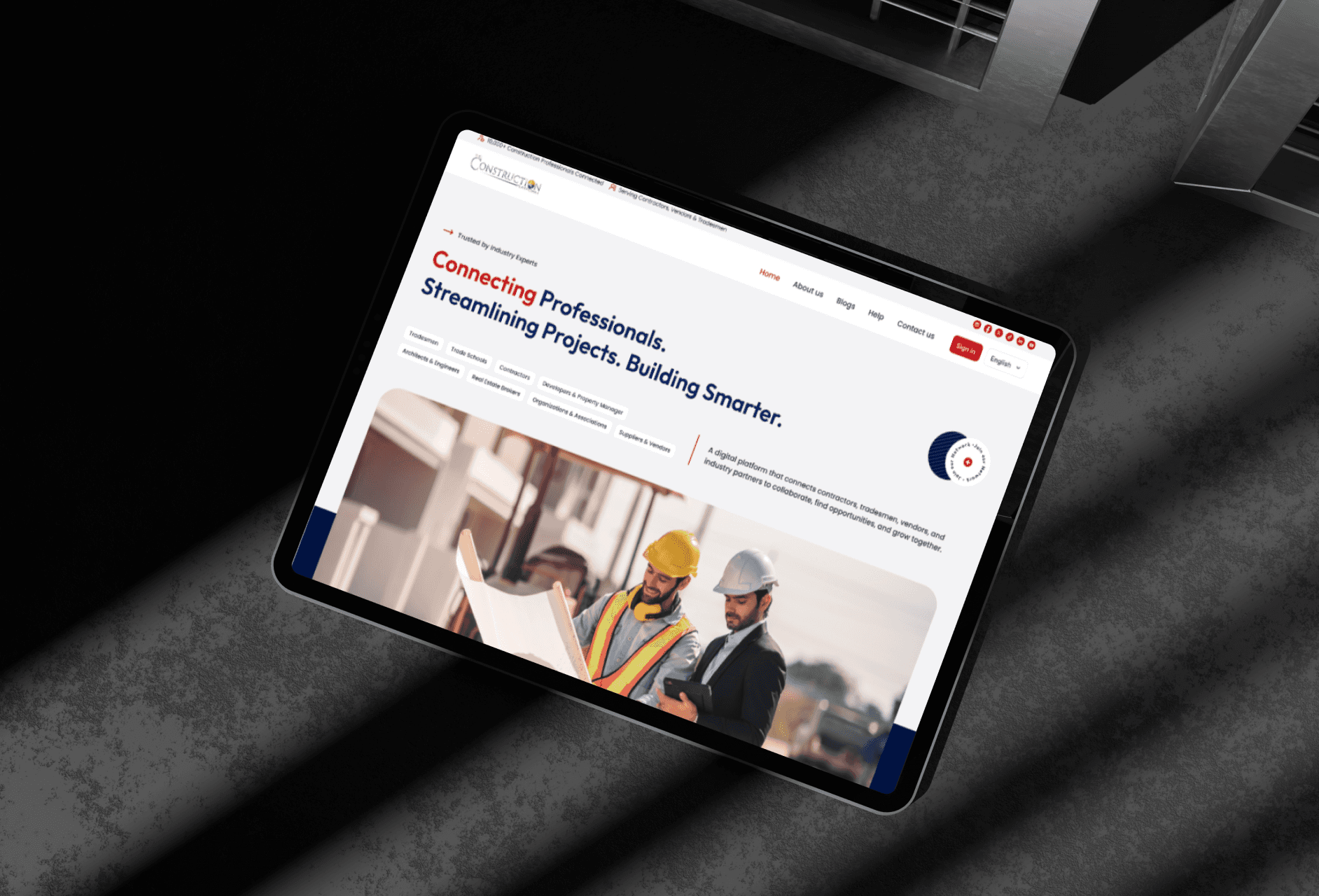
Design Decisions and Final Layout
I created a modern hero section with a direct value statement and clear actions. Below that, I designed segmented tabs to show benefits for different user types. The page also introduces how the platform works in simple steps, followed by statistics and testimonials for trust. I used Figma for layout, spacing, and responsive adjustments.
The new landing page replaces the old, outdated layout with a clean structure that tells a clear story: what the platform is, who it helps, and how to get started. The visual hierarchy guides users through benefits, process, and proof before presenting the sign-up form. The result is a more organized and persuasive experience that supports both new visitors and returning users.

Latest projects
Website
Landing Page Refinement for Ticket Marketplace Platform
Refined an AI-generated landing page to improve visual quality, structure, and user experience.

Website
Landing Page Refinement for Ticket Marketplace Platform
Refined an AI-generated landing page to improve visual quality, structure, and user experience.
Website
Tour Booking Website Design for Online Growth
Designed a 3-page tour booking website to help a travel business build online presence and simplify bookings.

Website
Tour Booking Website Design for Online Growth
Designed a 3-page tour booking website to help a travel business build online presence and simplify bookings.
Latest projects
Website
Landing Page Refinement for Ticket Marketplace Platform
Refined an AI-generated landing page to improve visual quality, structure, and user experience.
Website
Tour Booking Website Design for Online Growth
Designed a 3-page tour booking website to help a travel business build online presence and simplify bookings.

