
I focused on making the task selection process simple and guided, so users can move from identifying an issue to exporting the correct maintenance steps with less effort.

Ajay Jotangiya
UI/UX & Graphics Designer
I focused on making the task selection process simple and guided, so users can move from identifying an issue to exporting the correct maintenance steps with less effort.
Ajay Jotangiya
UI/UX & Graphics Designer
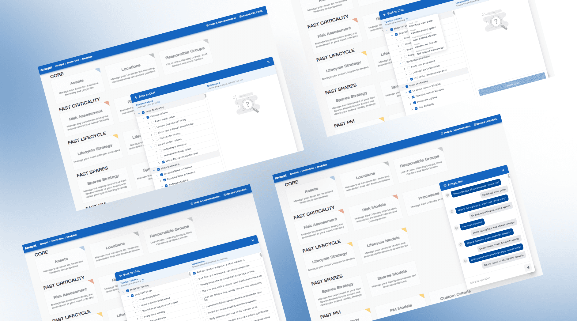
Amsyst is an asset management platform used in factories to track equipment and plan maintenance. Earlier, users had to search through long lists to find the right failure and task details, which was slow and confusing. I designed a guided chatbot that asks simple questions and shows only the relevant failures and maintenance steps, making the process faster and easier to follow.
Amsyst is an asset management platform used in factories to track equipment and plan maintenance. Earlier, users had to search through long lists to find the right failure and task details, which was slow and confusing. I designed a guided chatbot that asks simple questions and shows only the relevant failures and maintenance steps, making the process faster and easier to follow.
Understanding the User Flow
Technicians and maintenance engineers needed a simpler way to select assets and identify failure causes. The existing workflow required too many steps and forced users to search manually, which increased mistakes and slowed down task setup.
To fix this, I studied how technicians move from noticing a machine issue to deciding what needs to be done. Based on this, I planned a question flow that asks only the necessary details. The chatbot collects the basic context and then filters the failure lists to show only what is relevant. This removes unnecessary information and keeps users focused.


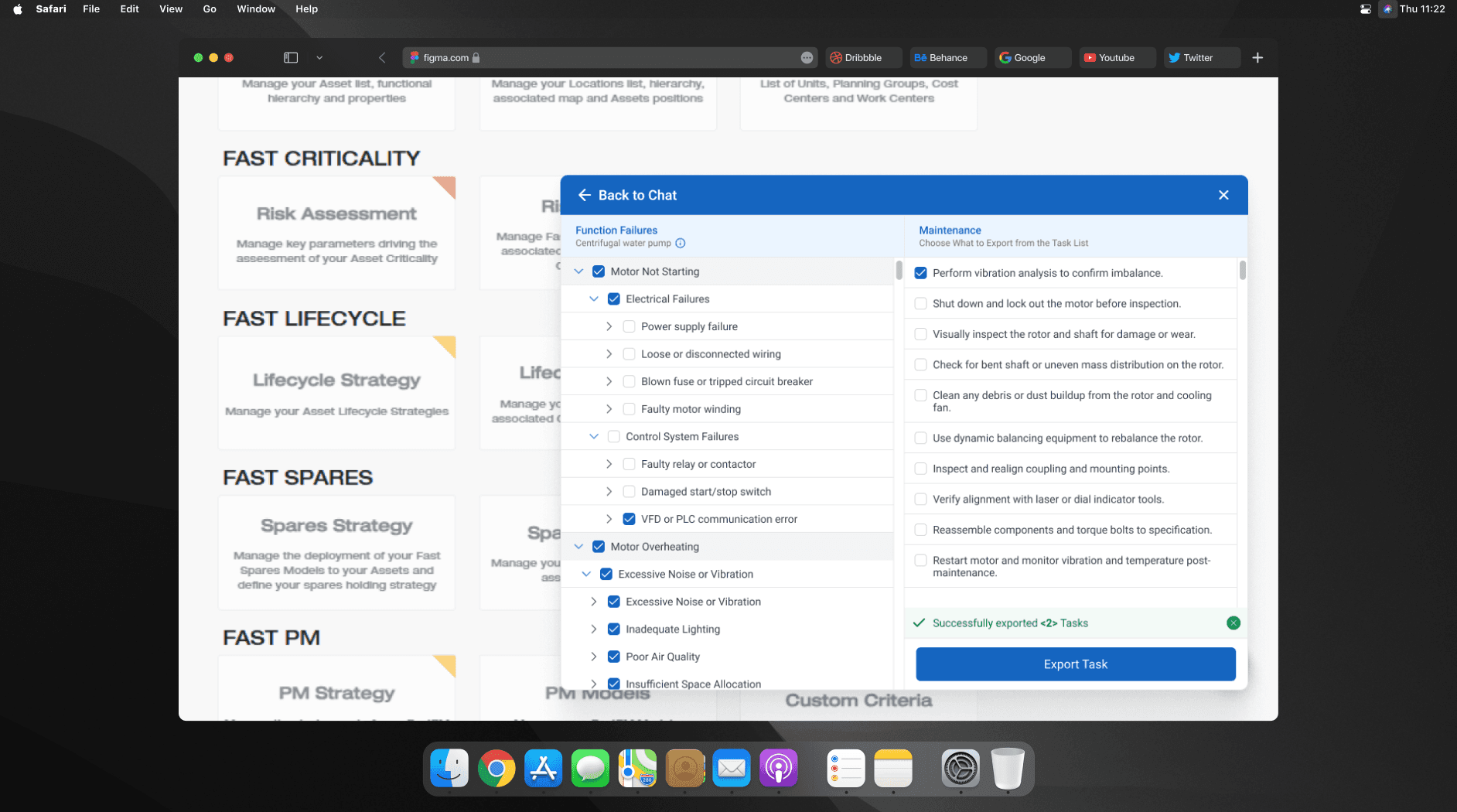
Design Approach and Interface Structure
The chatbot UI uses a two-panel layout. On the left, users select failure modes through grouped and collapsible lists. On the right, maintenance tasks appear based on those selections. Spacing, text size, and icon cues were improved to make scanning faster. I designed this in Figma.
The new flow replaces guesswork with a guided path. Instead of browsing large lists, users now answer clear prompts and directly see the most relevant failures and tasks. Before redesign, the process was heavy, visually cluttered, and required experience to navigate. After redesign, the experience is straightforward, organized, and faster to complete. Users can now move from identifying the issue to exporting the maintenance task list without confusion or delay.
Latest projects
Website
Landing Page Refinement for Ticket Marketplace Platform
Refined an AI-generated landing page to improve visual quality, structure, and user experience.

Website
Landing Page Refinement for Ticket Marketplace Platform
Refined an AI-generated landing page to improve visual quality, structure, and user experience.
Website
Tour Booking Website Design for Online Growth
Designed a 3-page tour booking website to help a travel business build online presence and simplify bookings.

Website
Tour Booking Website Design for Online Growth
Designed a 3-page tour booking website to help a travel business build online presence and simplify bookings.
Latest projects
Website
Landing Page Refinement for Ticket Marketplace Platform
Refined an AI-generated landing page to improve visual quality, structure, and user experience.
Website
Tour Booking Website Design for Online Growth
Designed a 3-page tour booking website to help a travel business build online presence and simplify bookings.

