
I wanted to make VPN Super Unlimited look clear, safe, and modern so users would feel confident downloading it. The focus was on making things simple but strong in design.

Ajay Jotangiya
UI/UX & Graphics Designer
I wanted to make VPN Super Unlimited look clear, safe, and modern so users would feel confident downloading it. The focus was on making things simple but strong in design.
Ajay Jotangiya
UI/UX & Graphics Designer
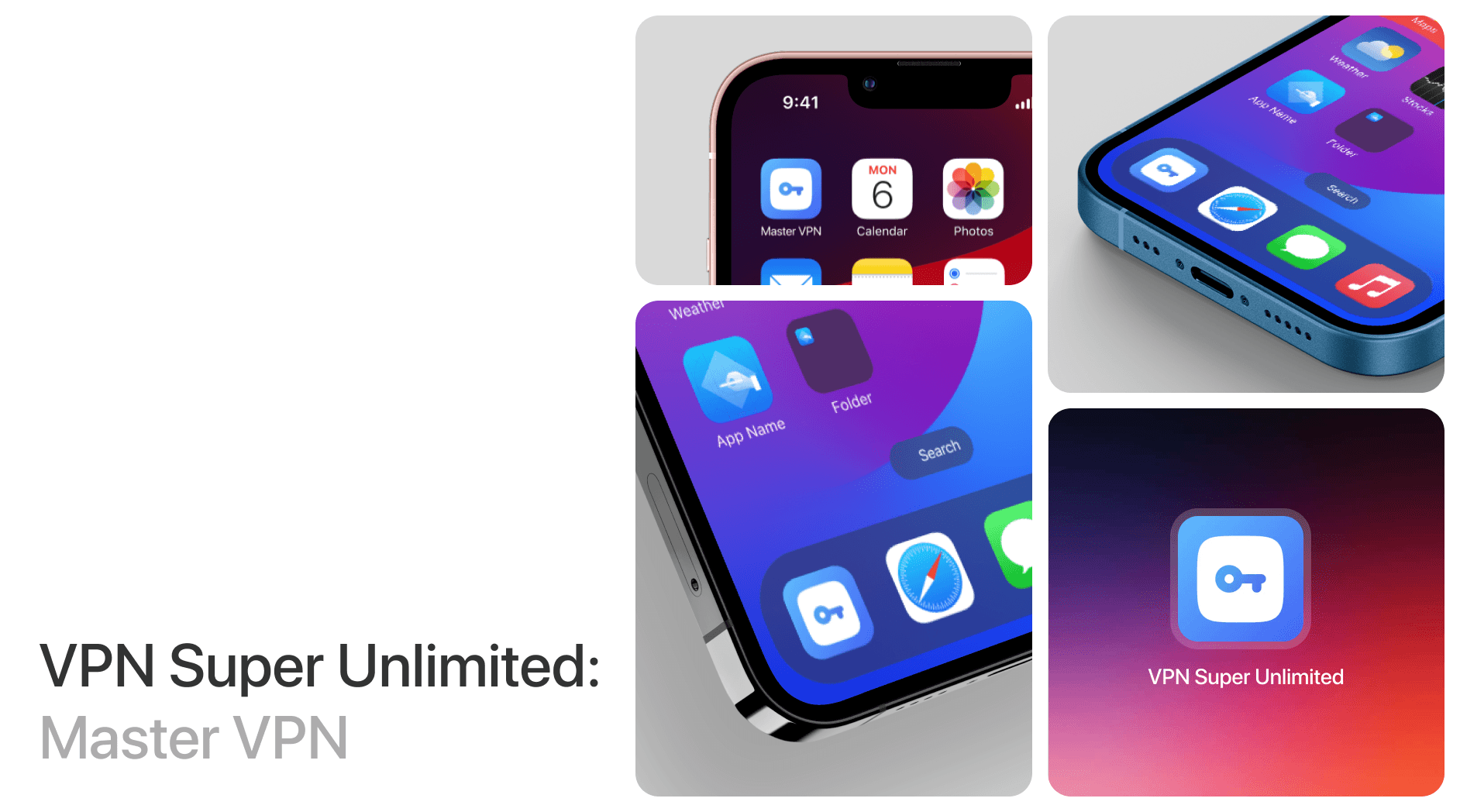
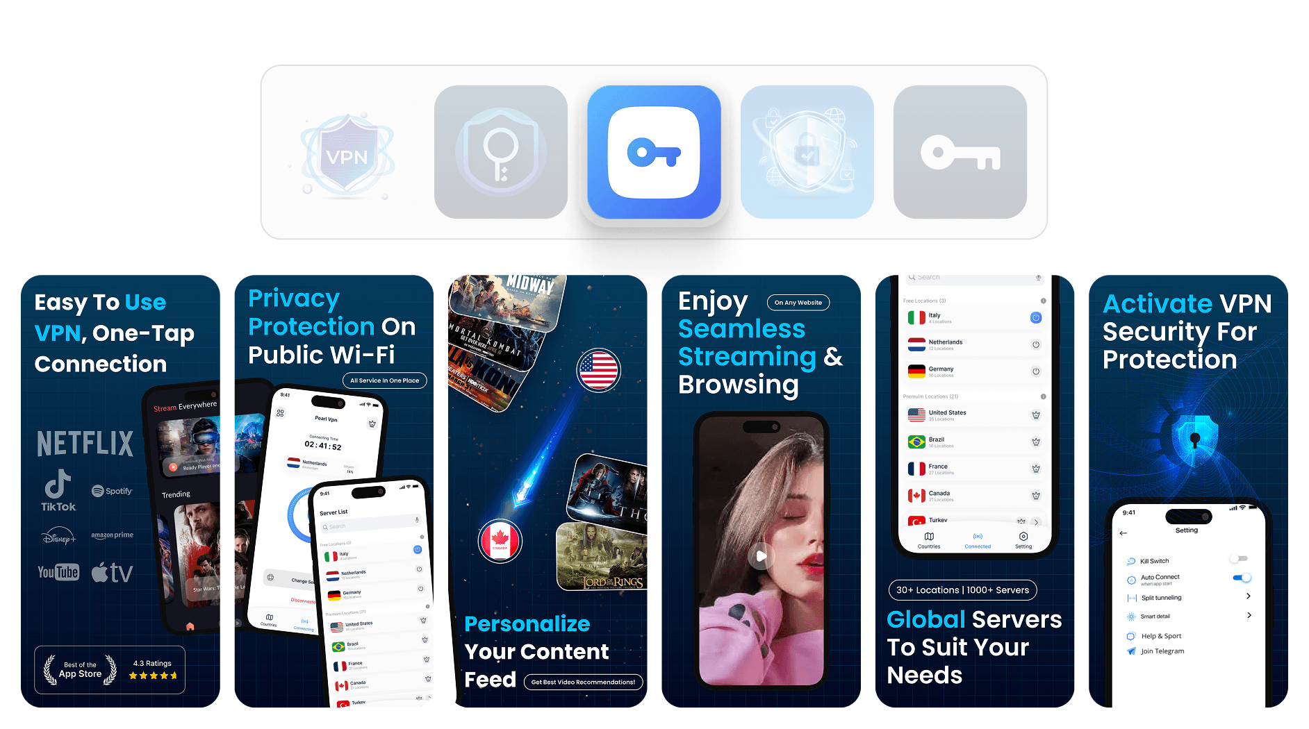
I worked on designing the app icon and App Store screenshots from scratch. The goal was to make the app look trustworthy, clean, and appealing enough to encourage downloads.
I worked on designing the app icon and App Store screenshots from scratch. The goal was to make the app look trustworthy, clean, and appealing enough to encourage downloads.
Starting with the App and Its Purpose
There was no reference or existing design. I used the app’s actual UI to build everything from the ground up.
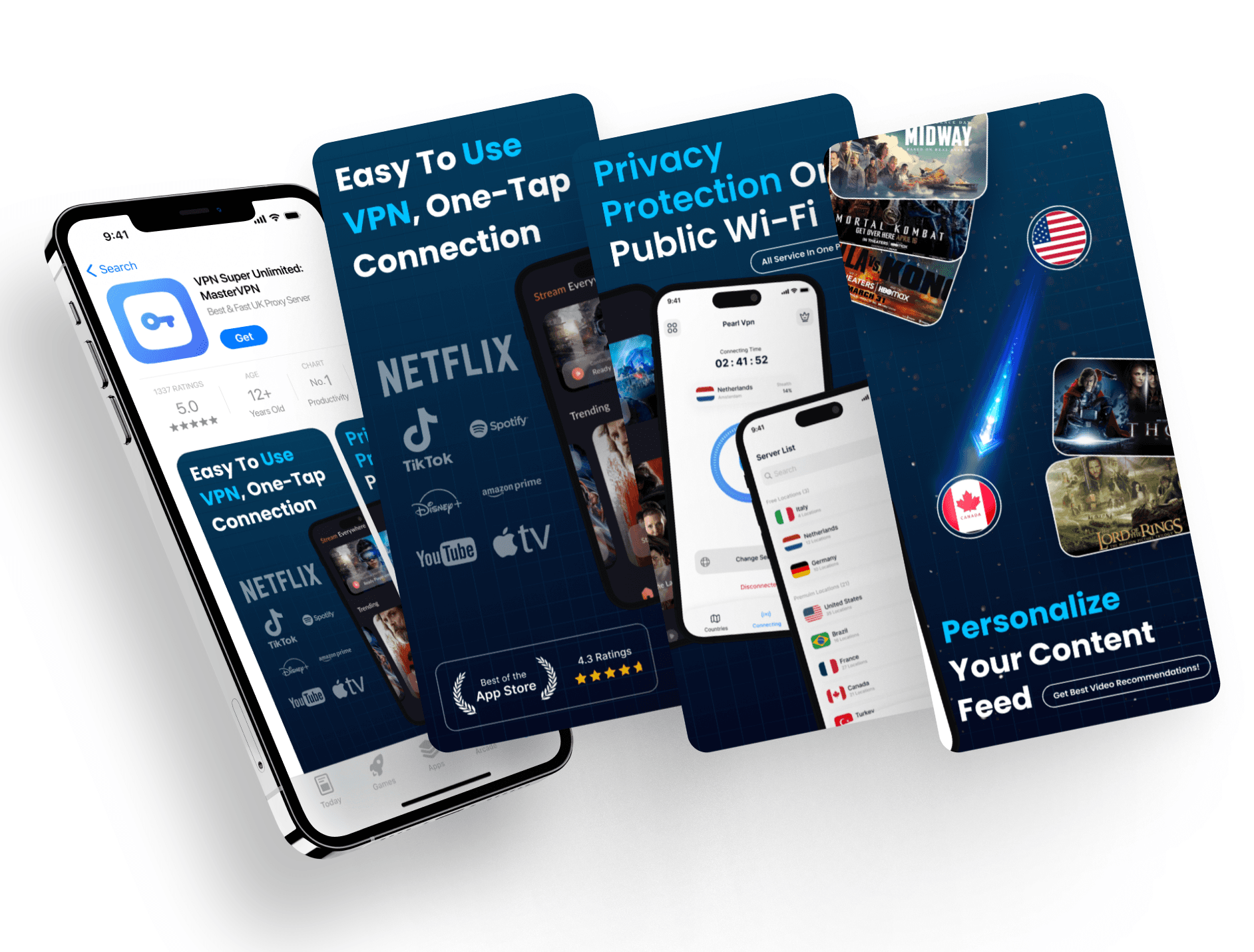
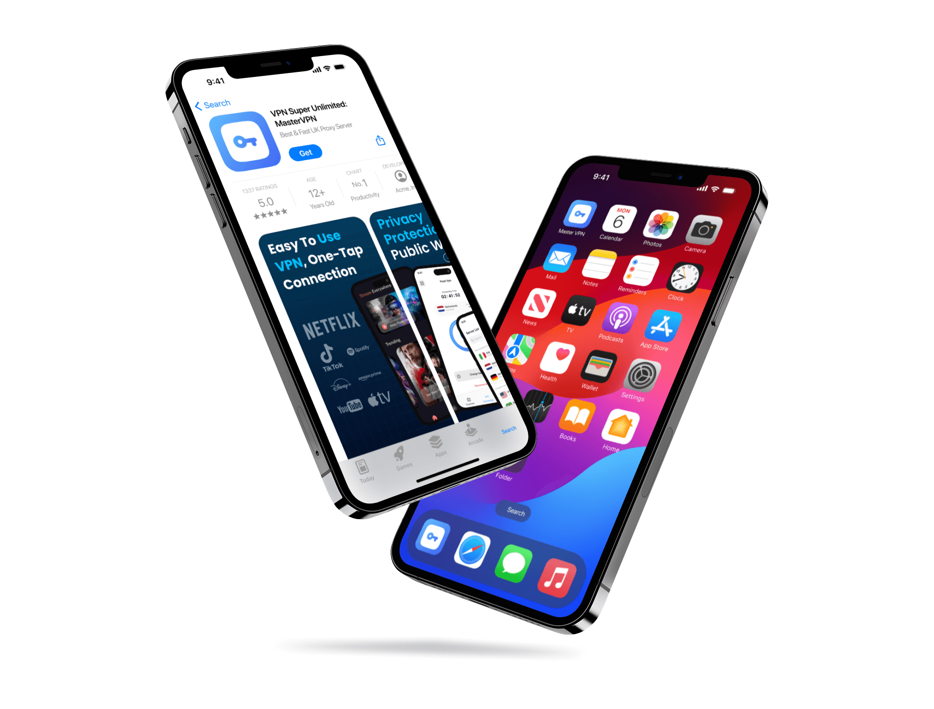
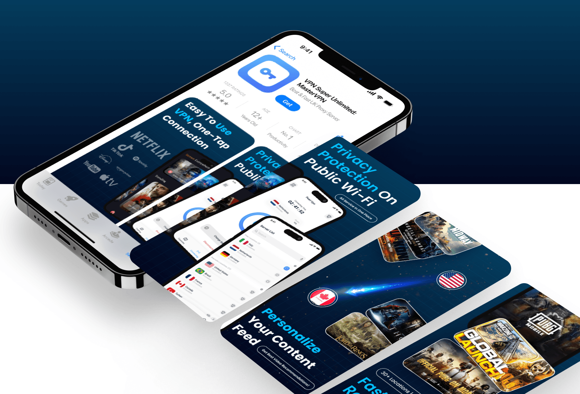
The client didn’t share any brand guide or sample designs, so I started by understanding what the app does and how it looks inside. It’s a VPN app, so I knew the visuals needed to feel safe and easy to trust. I matched the color palette with the app’s UI and focused on a simple, clean theme. The screenshots highlight the main features clearly, using short text and a calm visual flow that helps users get the idea quickly. The goal was to make sure anyone looking at the store page could instantly understand what the app offers.
Starting with the App and Its Purpose
There was no reference or existing design. I used the app’s actual UI to build everything from the ground up.
The client didn’t share any brand guide or sample designs, so I started by understanding what the app does and how it looks inside. It’s a VPN app, so I knew the visuals needed to feel safe and easy to trust. I matched the color palette with the app’s UI and focused on a simple, clean theme. The screenshots highlight the main features clearly, using short text and a calm visual flow that helps users get the idea quickly. The goal was to make sure anyone looking at the store page could instantly understand what the app offers.
Designing the Icon and Store Screens
The icon and screenshots are simple, bold, and follow the app’s color style for a consistent feel.
For the app icon, I picked shapes and symbols that feel secure and strong, like a shield. I kept the look modern and clean, using the same colors as the app so everything feels connected. When designing the screenshots, I focused on showing the key features in an easy-to-read way. The layout follows a smooth flow, helping users quickly understand how the app works and what makes it useful. Since there were no old assets, I built everything from scratch, and it made a big difference. The final visuals gave the app a much more polished and professional look. After applying these UI/UX improvements, the app store listing felt complete and ready to stand out. The client really liked the result.
Latest projects
Website
Landing Page Refinement for Ticket Marketplace Platform
Refined an AI-generated landing page to improve visual quality, structure, and user experience.

Website
Landing Page Refinement for Ticket Marketplace Platform
Refined an AI-generated landing page to improve visual quality, structure, and user experience.
Website
Tour Booking Website Design for Online Growth
Designed a 3-page tour booking website to help a travel business build online presence and simplify bookings.

Website
Tour Booking Website Design for Online Growth
Designed a 3-page tour booking website to help a travel business build online presence and simplify bookings.
Latest projects
Website
Landing Page Refinement for Ticket Marketplace Platform
Refined an AI-generated landing page to improve visual quality, structure, and user experience.
Website
Tour Booking Website Design for Online Growth
Designed a 3-page tour booking website to help a travel business build online presence and simplify bookings.

